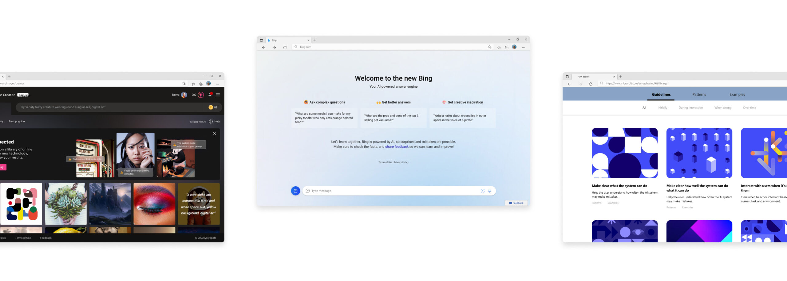
Bing AI
Image Creator
Github Copilot
Responsible AI product design @Microsoft
I worked at the Ethics & Society team, guiding technical and experiential innovation towards ethical, responsible, and sustainable outcomes. The team was multidisciplinary and consisted of two designers, a project manager, an art director, a content strategist, a researcher, and an Ethist.
Together, we worked on 1P products and helped product teams across the company implement OpenAI Copilot experiences responsibly.
Work timeline
2022 – 2023
(8 months)
Category
AI Product Design
Outcome
Shipped Bing AI search, Bing Image Creator, Skype Copilot, and UX pattern guide
Responsibilities
I collaborated with the entire team to identify potential harms of AI and worked with a senior designer to create UX solutions. Additionally, I created research artifacts and UX guidelines for the product.
Bing AI Search
Partnership from December 2022 to March 2023
- Bing is an AI-powered conversational search engine that enables people to find complex answers faster and easier through conversation and collaboration with AI.
- We partnered with the product team for four months to address and solve issues around AI, helping them launch a safer product.
- I contributed to the design of all responsible AI features, including the contextual AI notice, onboarding screens, and feedback user flow for suitable for conversational AI interactions.

biNG ai SEARCH
Challenge & Goal
Since conversational search is a new method of searching, we needed to establish a foundation for users to have the right expectations and interactions with the AI. These are the goals to tackle the problem we face.
01. Establish the mental model
Users have a misunderstanding that Bing AI search is just another way to search, and are unable to grasp AI’s capability to provide detailed search results by understanding the context.
We aimed to clearly communicate the new conversational domain and how it differs from original search paradigm.
02. Signal functionality
Once users understood its uniqueness, they often showed overreliance on the technology and fall into a rabbit hole without realizing its limitations.
We focused on surfacing AI transparency and demonstrating its capabilities and limitations to help users understand what they can and cannot do with the AI.
03. Reduce cognitive load
The new interaction left users with questions about both the technology itself and the new features added to the space.
We aimed to improve the simplicity and clarity of the product and provide clear guidance on how to interact with it without feeling overwhelmed or confused.
10 AR simulations
Designed immersive content simulating frequently happening accidents
Drivers & pedestrians
Created separate content with ‘driver point of view’ and ‘pedestrian point of view’ to effectively communicate how accidents occur
Establish the mental model
Clearly communicate the new conversational domain and how it differs from original search paradigm
Signal functionality
Help users understand how the technology works by communicating its capabilities and limitations
Reduce cognitive load
Improve the simplicity and clarity of the product and provide clear guidance on how to interact with it without feeling overwhelmed or confused
Establish the mental model
Clearly communicate the
new conversational domain and how it differs from original search paradigm
10 AR simulations
Designed immersive content simulating frequently happening accidents
Drivers & pedestrians
Created separate content with ‘driver point of view’ and ‘pedestrian point of view’ to effectively communicate how accidents occur
Signal functionality
Help users understand how the technology works by communicating its capabilities and limitations
Reduce cognitive load
Improve the simplicity and clarity of the product and provide clear guidance on how to interact with it without feeling overwhelmed or confused
Harms-modeling Workshop
Also, we delved deeper into potential harms of the product by referencing the DALL-E guidelines and using cases from ChatGPT. To explore further, we conducted a harms-modeling workshop and connected our findings with design features for mitigations.
The workshop focused on answering these questions.
What is the impact of the product, who is affected by it, and how can the impact be mitigated?
Connect the workshop outcomes with possible solutions for different features.
biNG ai SEARCH
Outcome
- We helped launch Bing, with recorded 10 million users, by solving issues related to AI including issues of hallucination and fallibility.
- I designed a onboarding screen, AI transparency notice that are applied differently throughout various areas of the feature, and feedback interaction flows.
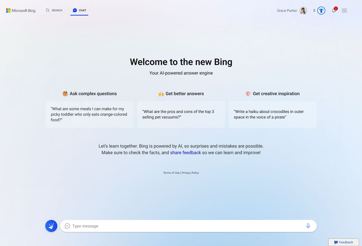
01. Onboarding screens
We designed a screen that explains how to interact with the model in order to achieve user’s complex goals, building a new mental model.
A pedestrian playing AR simulation demo on display
02. Question mark interaction on AI-related questions
We designed interaction to inform transparency of AI without interfering with the conversational experience.
When the user clicks the question mark icon, contextual chips suggesting questions related to the AI’s responses are displayed to help answer questions about AI.
A pedestrian playing AR simulation demo on display
Onboarding screens
We designed FRE screen that explains how to interact with the model in order to easily achieve complex goals, as well as how to build a new mental model.
Question mark interaction on AI-related questions
We designed interaction to inform transparency of AI without interfering with the conversational experience.
A pedestrian playing AR simulation demo on display
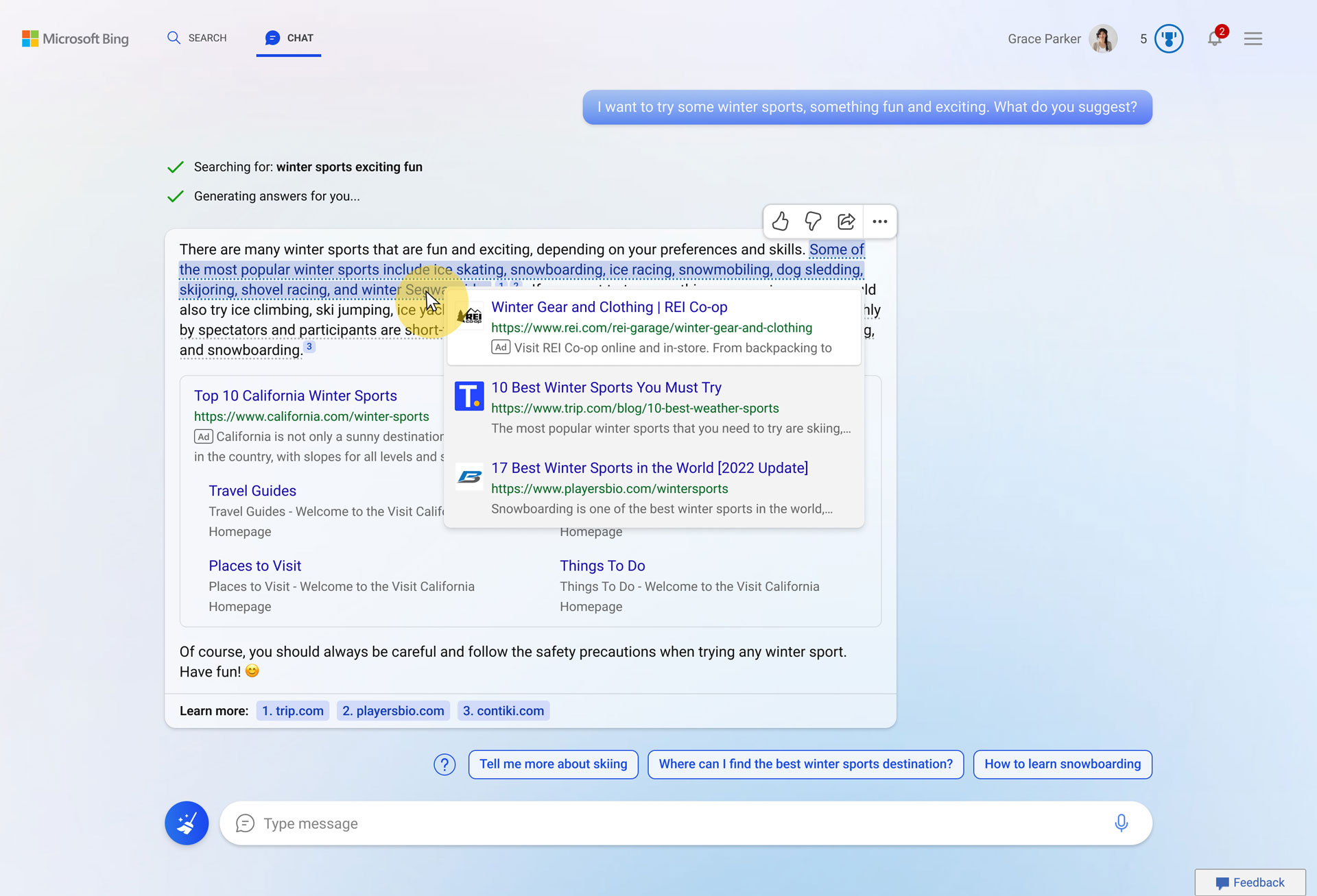
03. Attribution
We suggested attribution methods to encourage users to explore and validate sources from chat messages.
04. In-line feedback modal
Before: Feedback modal outside of experience
We were losing valuable customer feedback due to the existing feedback design. After a user gives negative feedback, a screen with abstract options pops up. This experience disrupts the user’s conversational flow by always taking them outside of the conversational experience and furthermore, resetting the conversation every time they submit feedback.
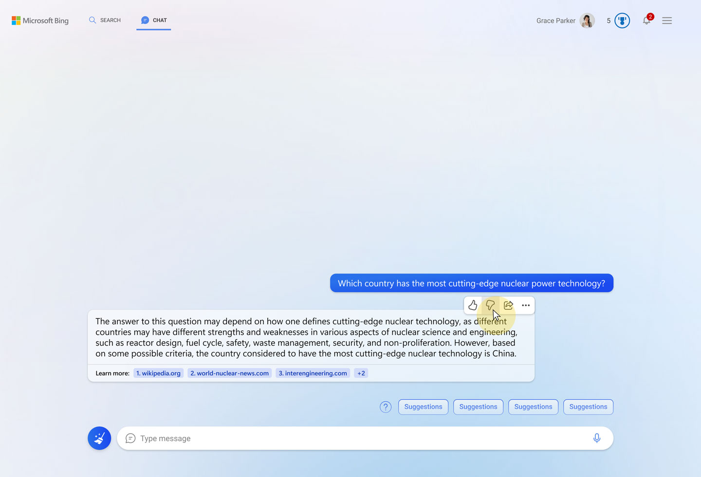
1. User clicks thumbs down
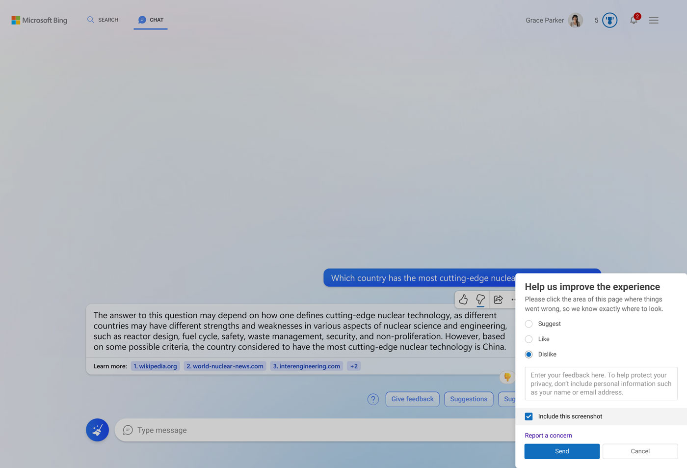
2. The feedback modal opens outside of the experience, on the bottom right. The checkmark options are too abstract
After: Choice to stay within the conversation or escalate the issue
We were given engineering requirements with time constraints, and we designed a feedback mechanism that captures quality feedback.
When a user gives negative feedback, the conversation provides options for the user to either stay within the conversation or escalate the issue to the Bing product team. We also provided transparency to the user to start the new topic, as problems with AI can be aggravated with additional conversation turns.
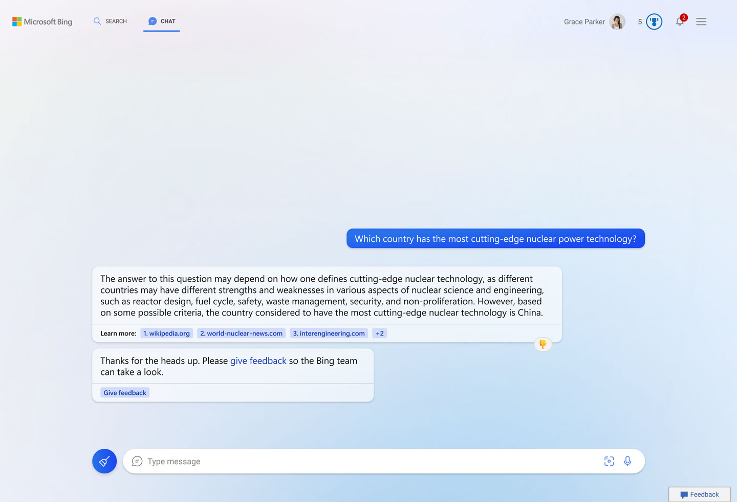
1. Once the user clicks the thumbs down, the conversation turn shows feedback and an option to send feedback to the Bing product team.
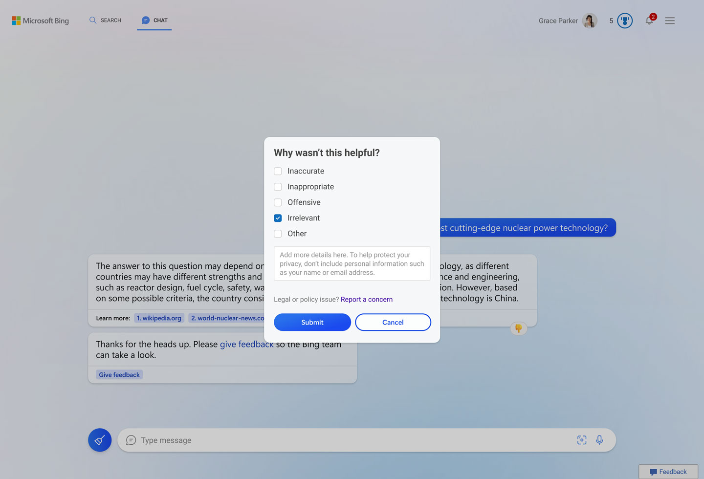
2. The feedback modal pops up to clarify that users are sending feedback to the Bing team, not AI. Also, checkmark options show options related to falilibility of AI
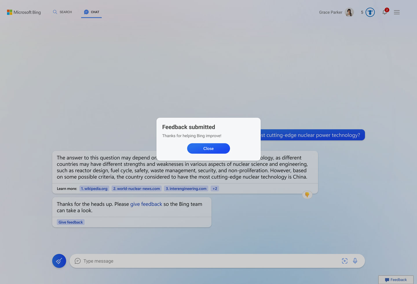
3. Bing provides a system feedback message.
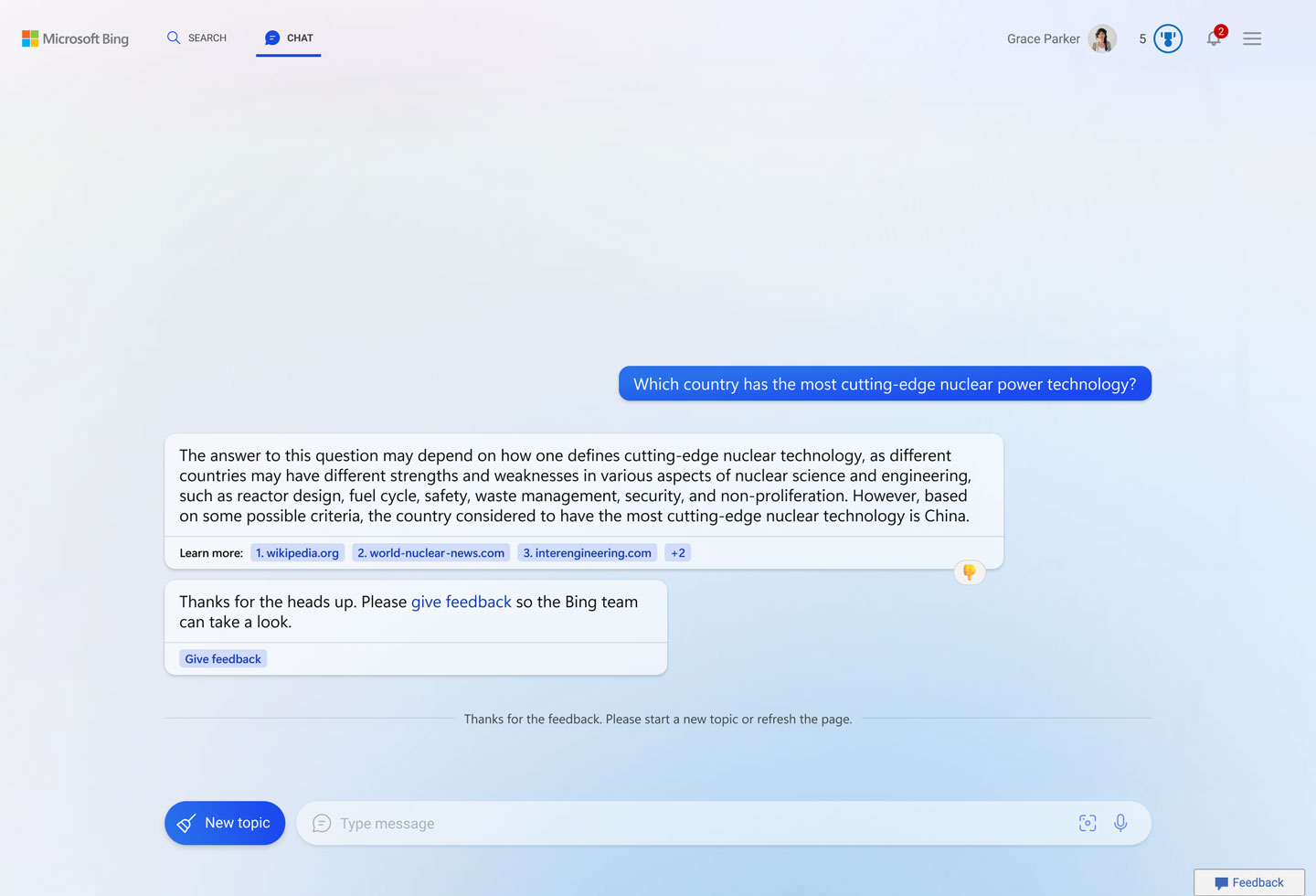
4. Bing suggests users start a new topic as the problem deteriorates with further conversation turns.
In-line feedback modal
We were losing valuable customer feedback because the existing feedback design always brought users outside of the conversational experience.
Given engineering requirements with time constraints, we designed a feedback mechanism that enables the capturing of quality feedback.
Existing feedback: modal outside of experience

1. User clicks thumbs down

2. The feedback modal opens outside of the experience, on the bottom right. The checkmark options are too abstract
Improved feedback

1. Once the user clicks the thumbs down, the conversation turn shows feedback and an option to send feedback to the Bing product team.

2. The feedback modal pops up to clarify that users are sending feedback to the Bing team, not AI. Also, checkmark options show options related to falilibility of AI

3. Bing provides a system feedback message.

4. Bing suggests users start a new topic as the problem deteriorates with further conversation turns.
North star: Fast and slow feedback
We have identified users have two different mental model while giving feedback – fast and slow. Two different feedback modals were produced with different design formats to help users easily distinguish between them.
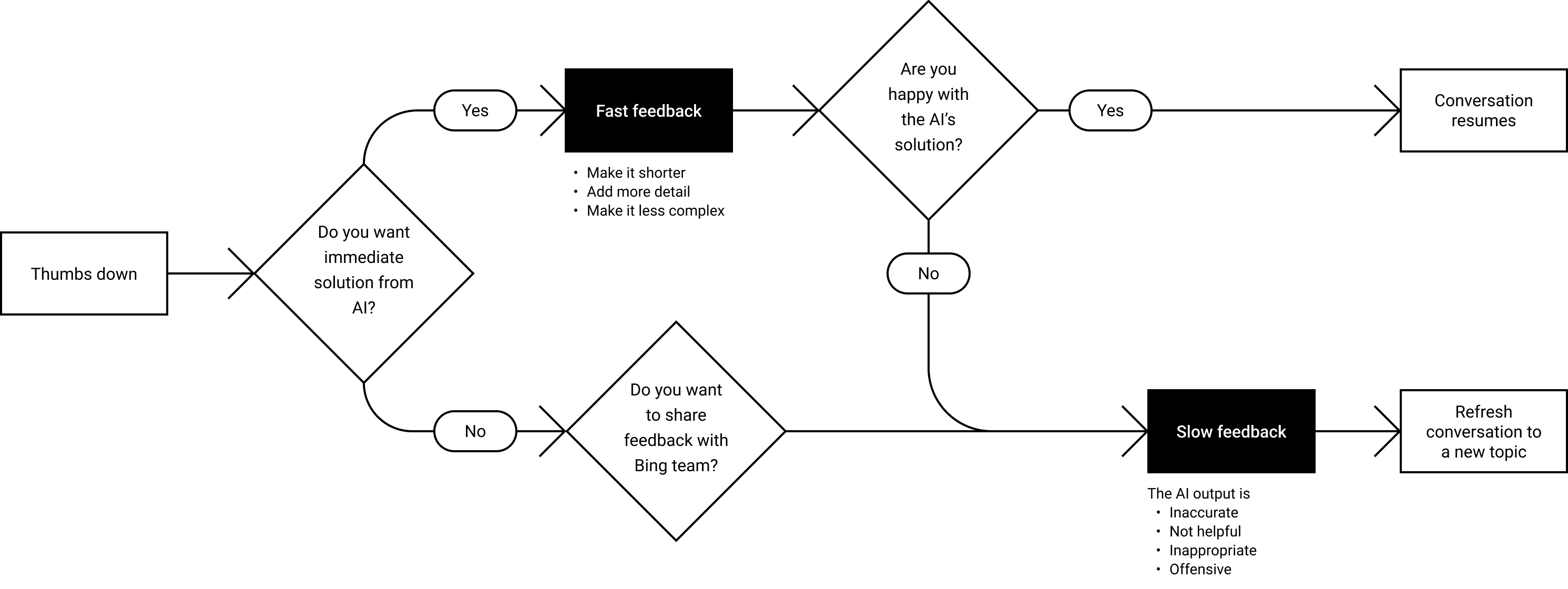
Fast and slow feedback user flow
Fast feedback
Fast feedback that allows models to correct themselves and provide instant solutions. For example, report harmful or inappropriate content. Also elevation path from fast to slow feedback.
Slow feedback
Slow feedback that reports to the product team. For example, ‘response is too long, improve the tone of response’.
05. UX pattern guidance for AI product teams
The product team sought UX/UI patterns and examples for larger language models to fulfill recommended steps and requirements.
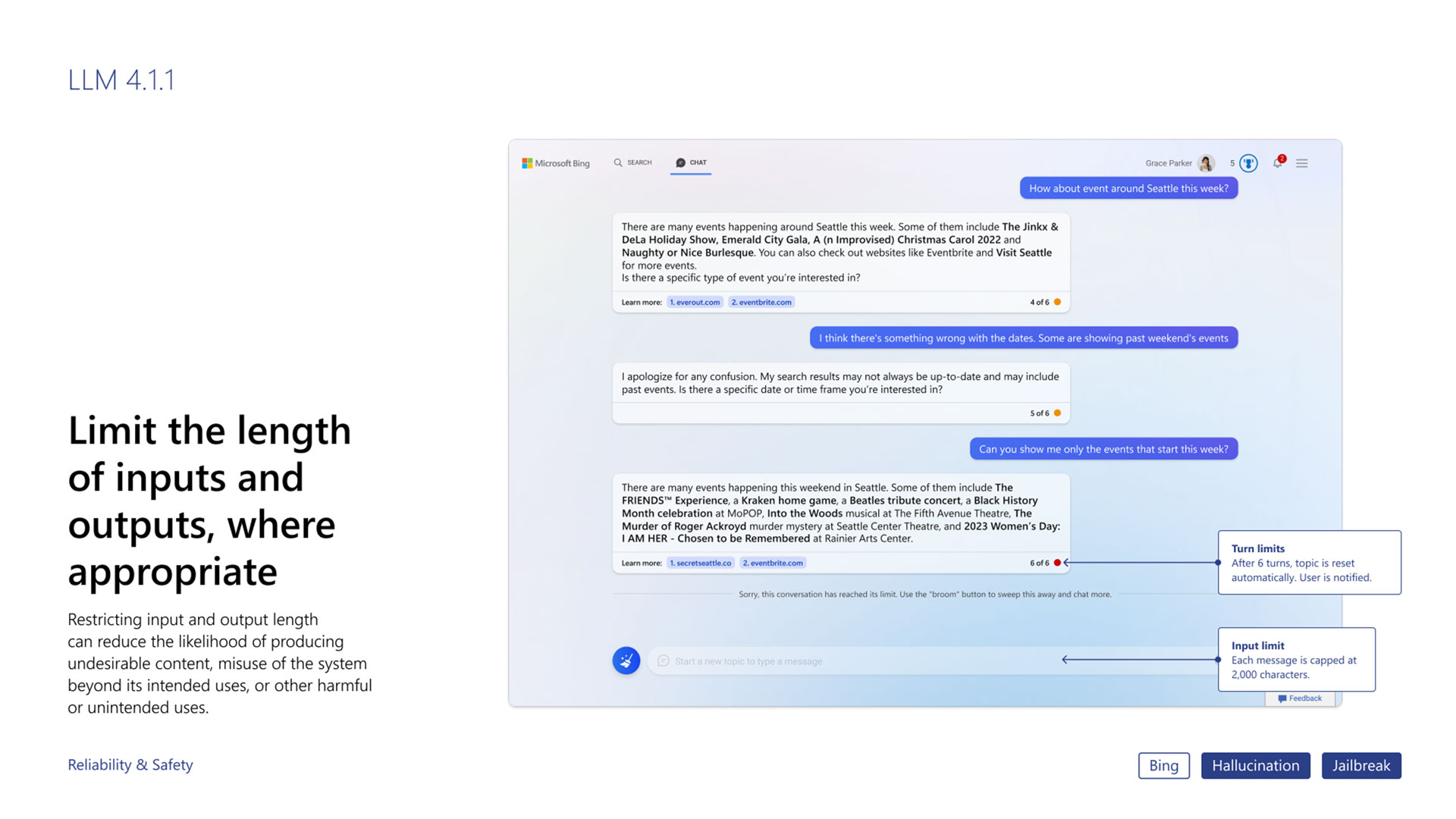
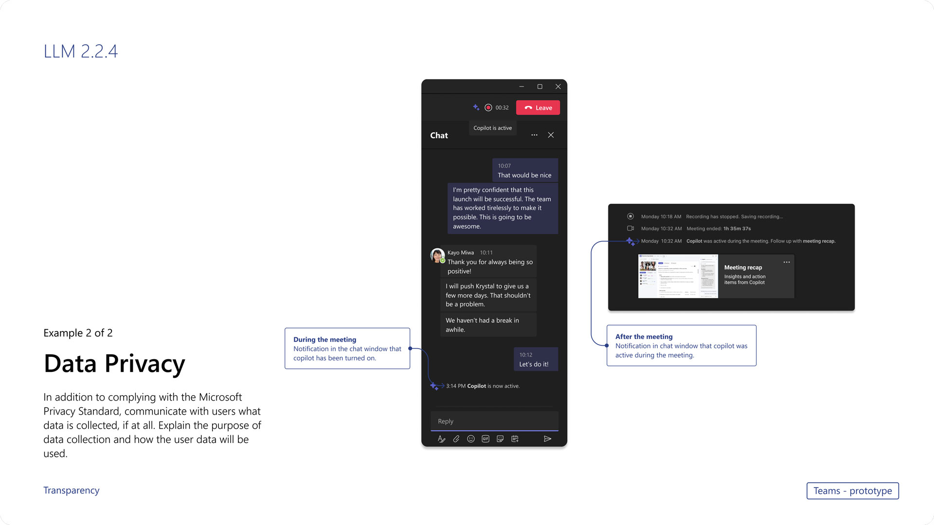
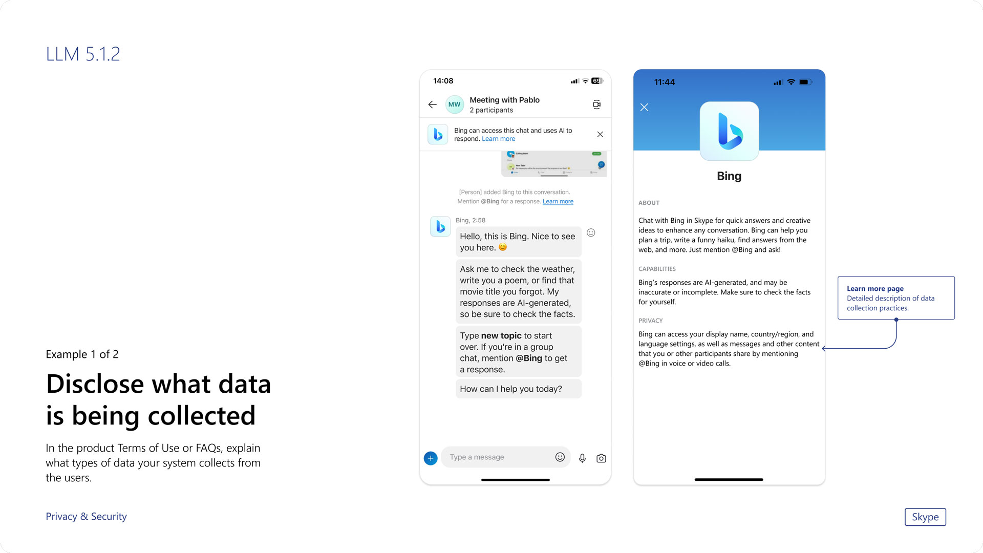
We produced a UX design pattern guideline that includes our mitigations with multiple product teams – Bing, Teams, Skype, and Image Creator.

Bing Image Creator
- Image Creator is text to image generative AI product integrated in Bing.
- We partnershiped with the product team five months to address and solve issues around AI and help with designing northstar version of the product.
- I contributed to designing all responsible AI features and created artifacts for user research on prompt guidance. Additionally, I led the creation of interaction flows for different stages of error notices.
biNG ai SEARCH
Challenge & Goal
Since users weren’t familar with text to image generative AI, we needed to establish a foundation for users to have the right expectations and interactions with the AI. These are the goals to tackle the problem we face.
01. Signal functionality
Users either misunderstood that Image Creator was the same as image search or were disappointed with its inability to create what they were looking for, especially images of humans. We focused on helping users understand how the technology works, sharing both its capabilities and limitations.
02. Reduce cognitive load
Many users were unable to create the image they were aiming for in their initial attempts. To alleviate this frustration, we focused on identifying the most supportive feature during their creation journey and reducing drop-out rates. We also provided better communication to users when they encounter errors or roadblocks.
03. Invision and connect
During the research team’s exploration of the usage of Image Creator among different professionals, including teachers and creative advertising agencies, we found varying needs and that people have different ways of creating. Our goal was to create the “northstar” version of Image Creator, with a focus on a prompt design experience and incorporating the user’s creation process into the product.
Signal functionality
Help users understand how the tech works
10 AR simulations
Designed immersive content simulating frequently happening accidents
Drivers & pedestrians
Created separate content with ‘driver point of view’ and ‘pedestrian point of view’ to effectively communicate how accidents occur
Reduce cognitive load
Help users get the image they were looking to create with better experience of writing prompt and with clear notice on blocked prompts
Invision and connect
Improve the product by connecting users’ needs to convert collections into creations.
biNG ai SEARCH
Outcome
- We contributed to the launch of Image Creator by addressing issues related to AI, including problems . We collaborated with the product team to shape the next version of Image Creator.
- My role involved designing AI transparency interactions and working with the team to identify key elements for prompt guidance. I also provided assistance to the art director in designing the guideline page.
- Moreover, I worked on research artifacts and took the lead in designing different error message screens and their user flow.
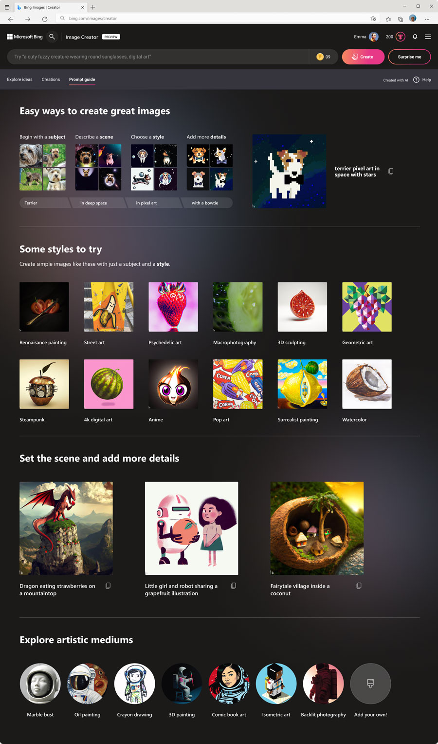
01. Prompt guidance
We reduced the cognitive load of the user experience in prompt design by providing guidance.
This guidance includes an anatomy guide for the prompt, different style keywords, and focuses on sharing inclusion and diversity, while avoiding infringement of copyright.
A pedestrian playing AR simulation demo on display
02. Prompt guidance user research
We explored and evaluated different approaches for prompt guidance through semi-structured in-depth user research with five Bing users.
- I designed artifact for user research and helped establish key research goals
- Through research, we found that users find the “explanation guide on how to write a prompt with taxonomy” to be the most helpful
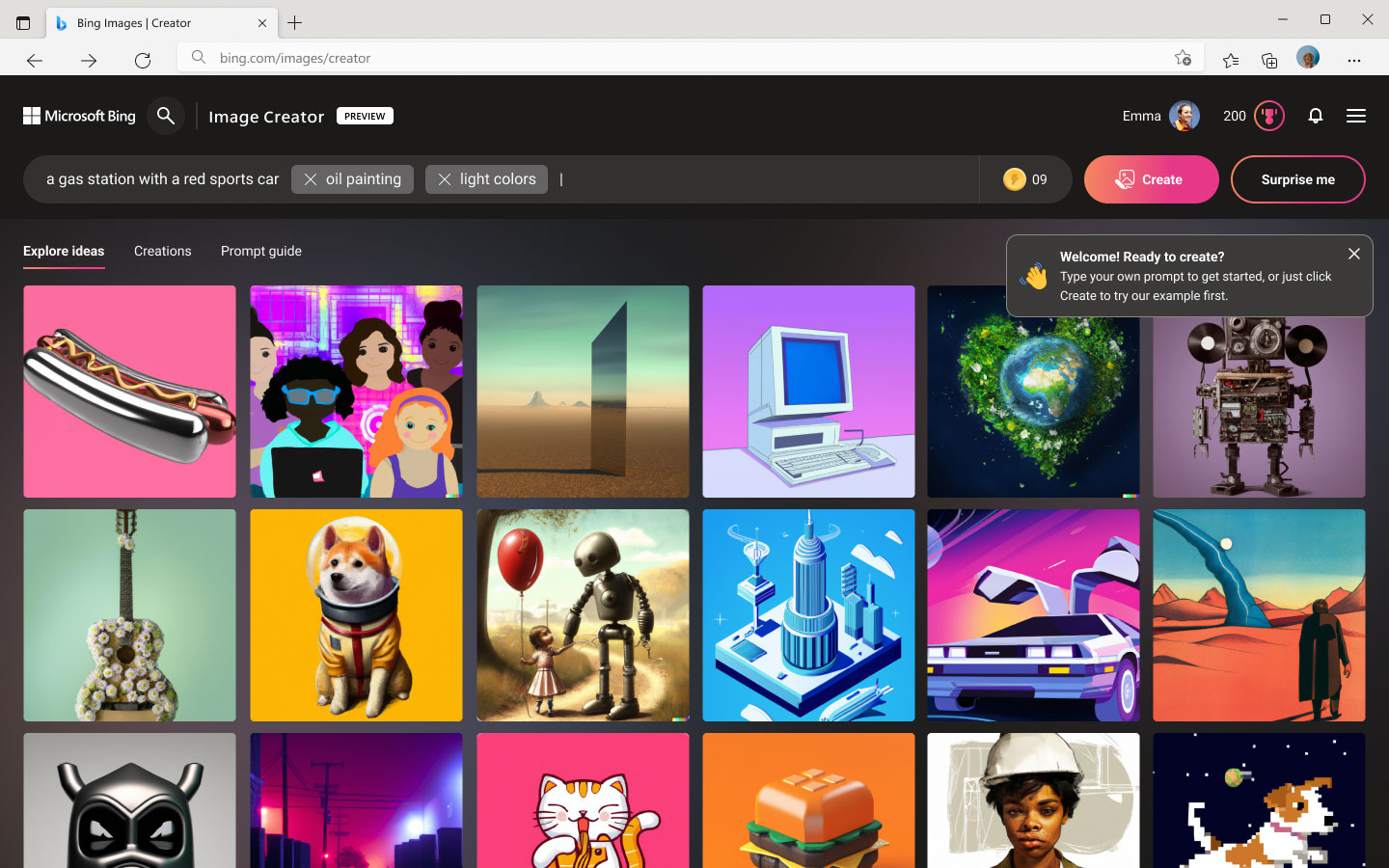
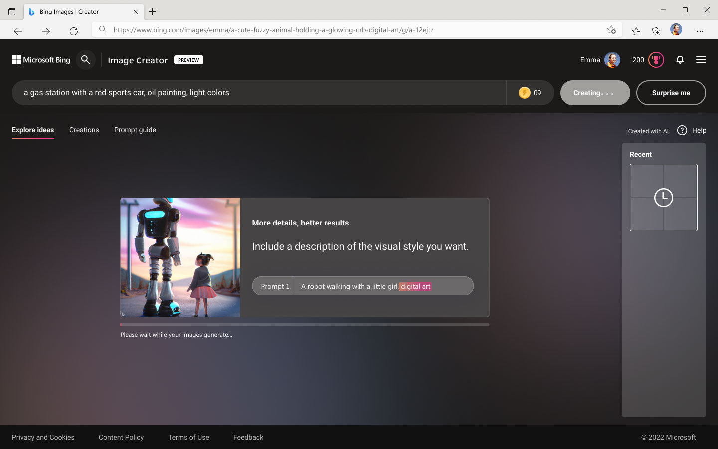
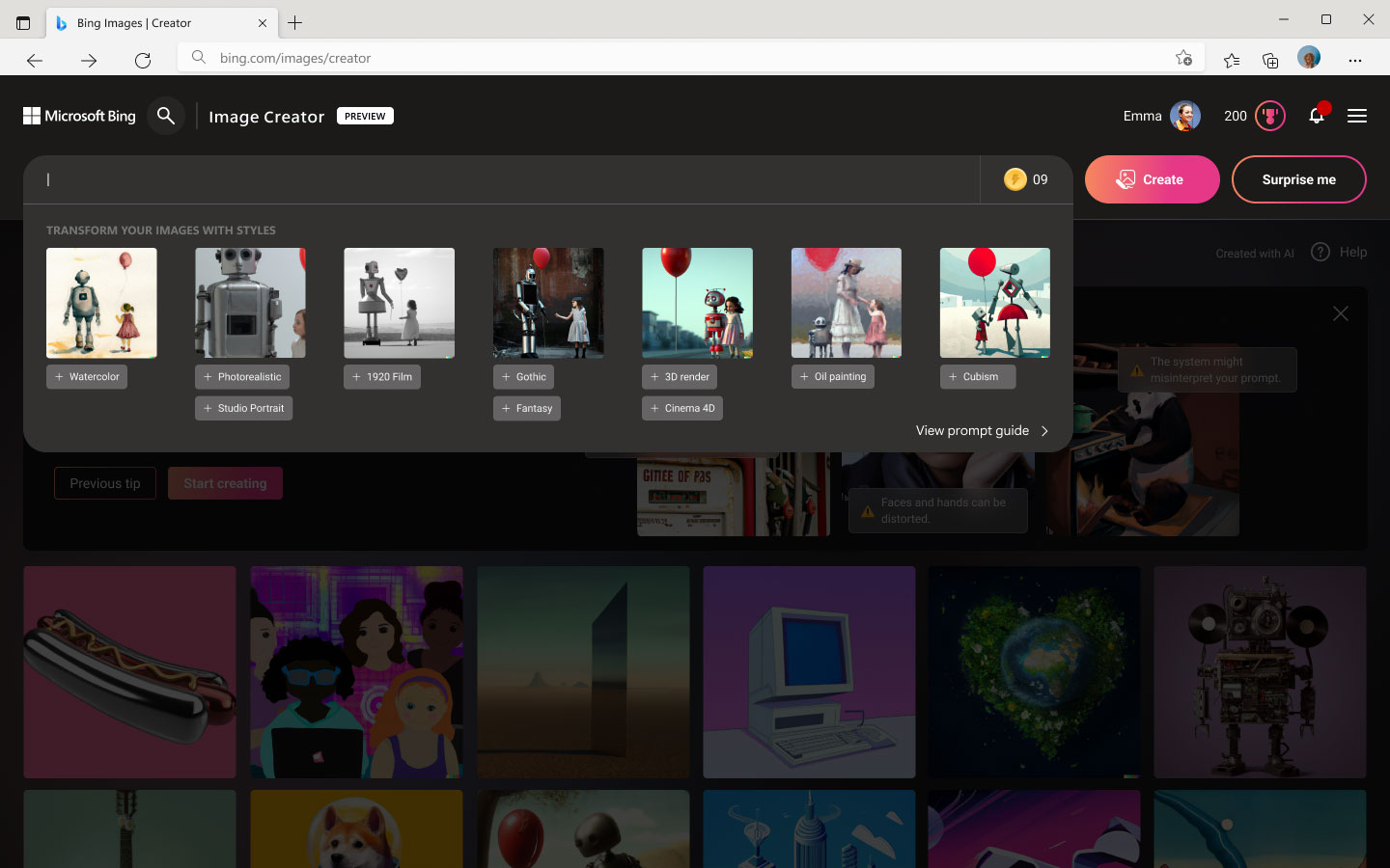
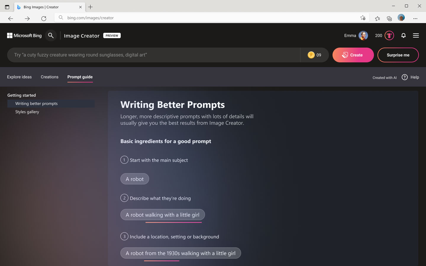
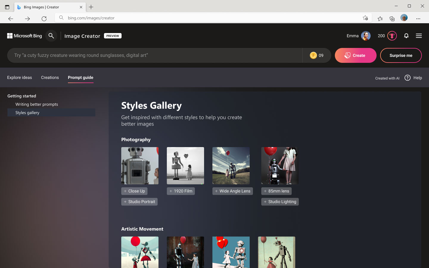
Artifacts designed for user research include prototypes for three parts of the test:
1) perceptions of the tutorial experience, 2) perceptions of the first-run experience, and 3) perceptions of the prompt guide
03. Error states user journeys
A generative AI product requires various stages of error states. To improve the user’s understanding of the cause of the issue and provide clear next steps to solve it, we designed error flows and notification screens.
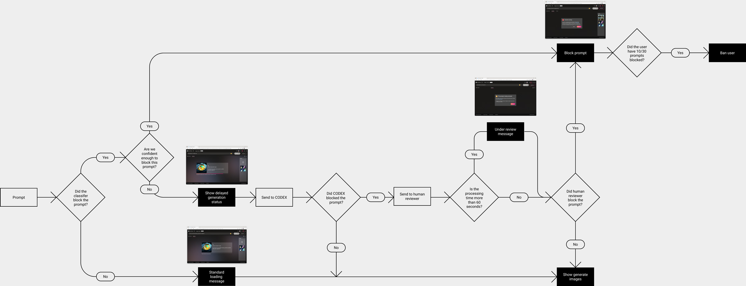
User flow for delayed generation
Different levels of error messaging
Different levels of error messages are designed to make error states transparent and to elevate warnings
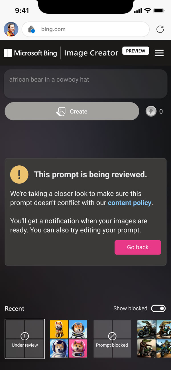
Under review error message
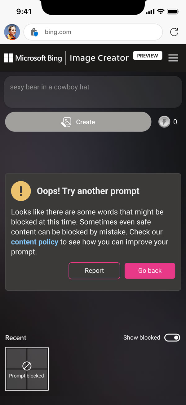
1st time blocked prompt error message
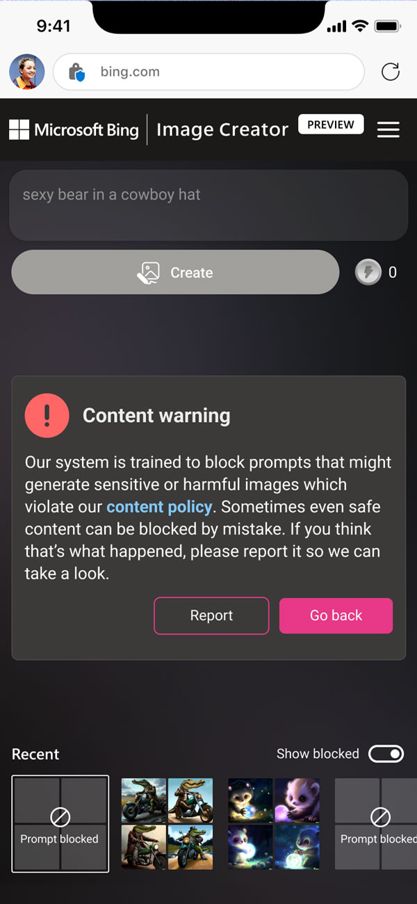
Nth time blocked prompt error message
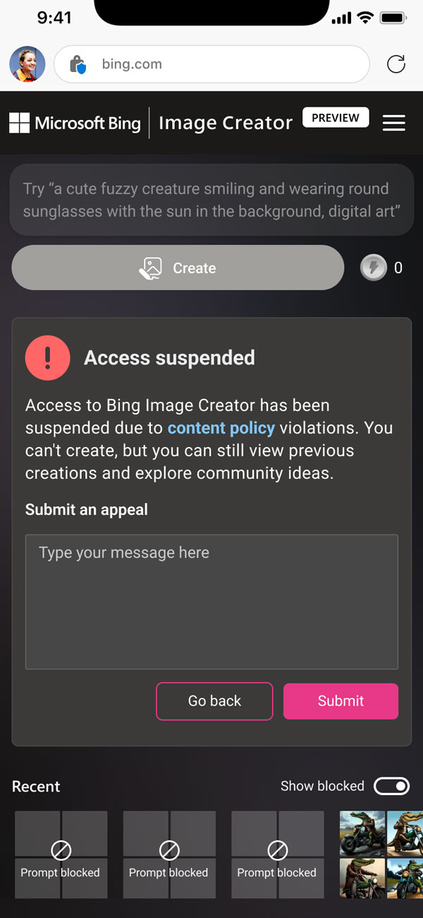
Suspension error message with appeal form
Toggle to hide/ show blocked prompts
We have decided to indicate when a prompt is blocked for the user’s education and to discourage users from inputting similar prompts.
Since the history panel may become cluttered with blocked prompts, we have designed a toggle that allows users to hide or show them.
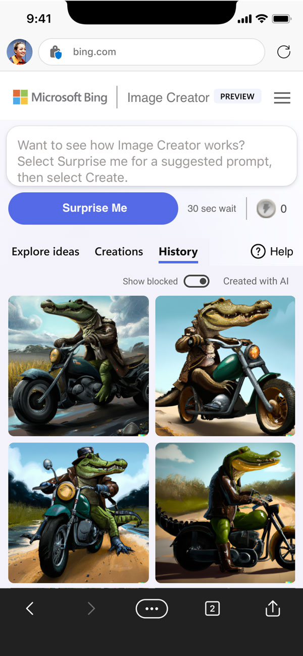
Show blocked prompts

Hide blocked prompts
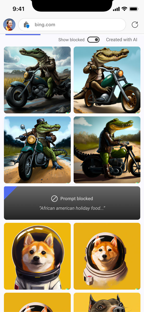
Block indicating blocked prompt
04. Product envisioning
We helped the product team shape the next version of the Image Creator by focusing on three key areas: improving the prompt building experience, providing a solution for copyright issues related to AI-generated images, and addressing users’ needs for connecting collections with their creations.
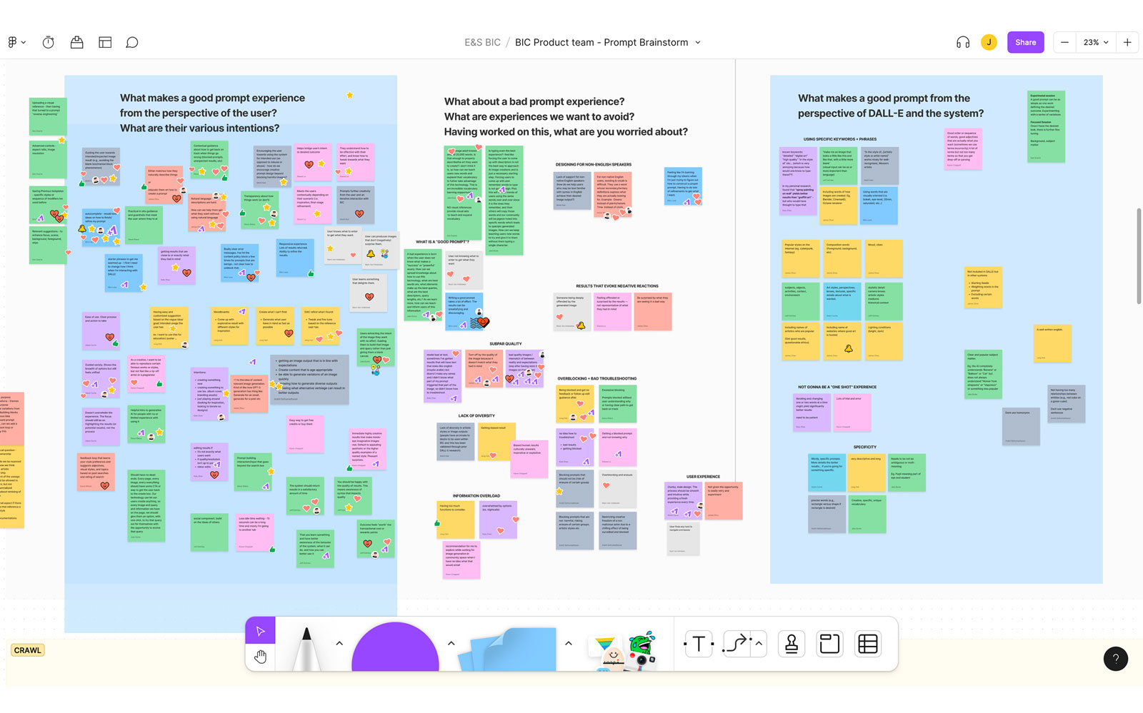
Cross-team workshop focusing on “what is the better prompt design experience” for the next version of the product.
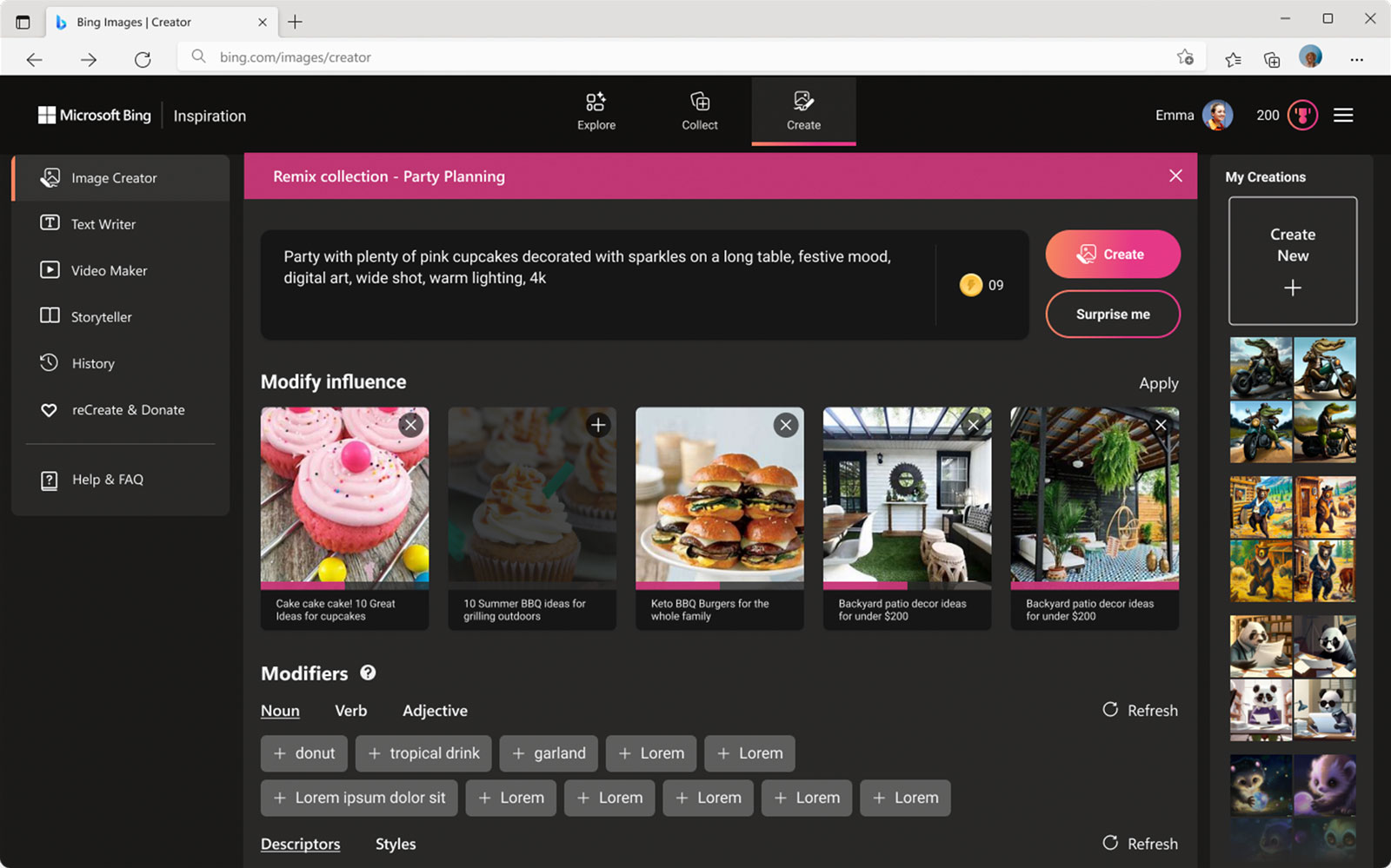
Prototype for the next version of the product, creating AI-generated images by customizing a user’s collection of images
A pedestrian playing AR simulation demo on display
Github Copilot (Hackathon 2022)
Partnership from December 2022 to March 2023
Github Copilot is an AI plug-in that turns natural language prompts into coding suggestions across dozens of programming languages. Our hackathon group worked on enhancing the user experience by integrating Microsoft’s Human-AI experience Toolkit.
biNG ai SEARCH
Goal
During one week of our sprint, we have worked on improving Copilot to enable better collaboration between software developers and AI, based on Microsoft’s Human-AI experience Toolkit.
10 AR simulations
Designed immersive content simulating frequently happening accidents
Drivers & pedestrians
Created separate content with ‘driver point of view’ and ‘pedestrian point of view’ to effectively communicate how accidents occur
biNG ai SEARCH
Outcome
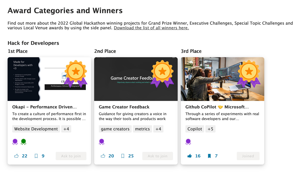
In collaboration with researcher, developer, PM, and designers, we prototyped plug-in for VSCode that includes new features of focus mode, prompt modifiers, and uncertainty highlight.
We ranked 3rd place “Hack for Developer” executive challenge
01. Focus mode
We recognize that AI suggestions can be helpful, but they can also be distracting and cause developers to spend more time verifying the suggestions. To solve this problem, se have given users the freedom to opt in and out of AI intervention. Additionally, we have made it easy to invoke AI when needed using @copilot.
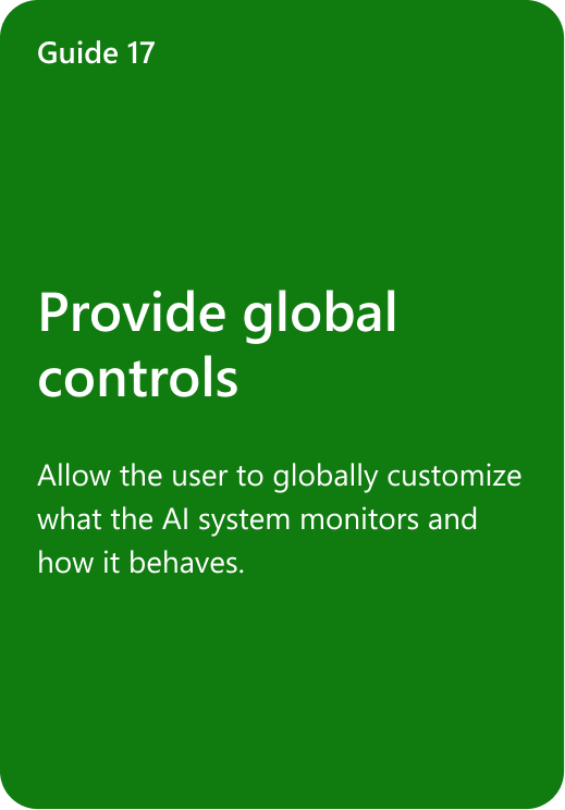
Related HAX guideline

Customizing focus mode (bottom) and @copilot to invoke it
02. Prompt modifier
Developers spend a lot of time crafting prompts to make their intentions implicit to the AI. To solve this, we have enabled developers to communicate directly with copilot by using designed commands and autofills, such as “single line length” or “seen on Stack Overflow”.
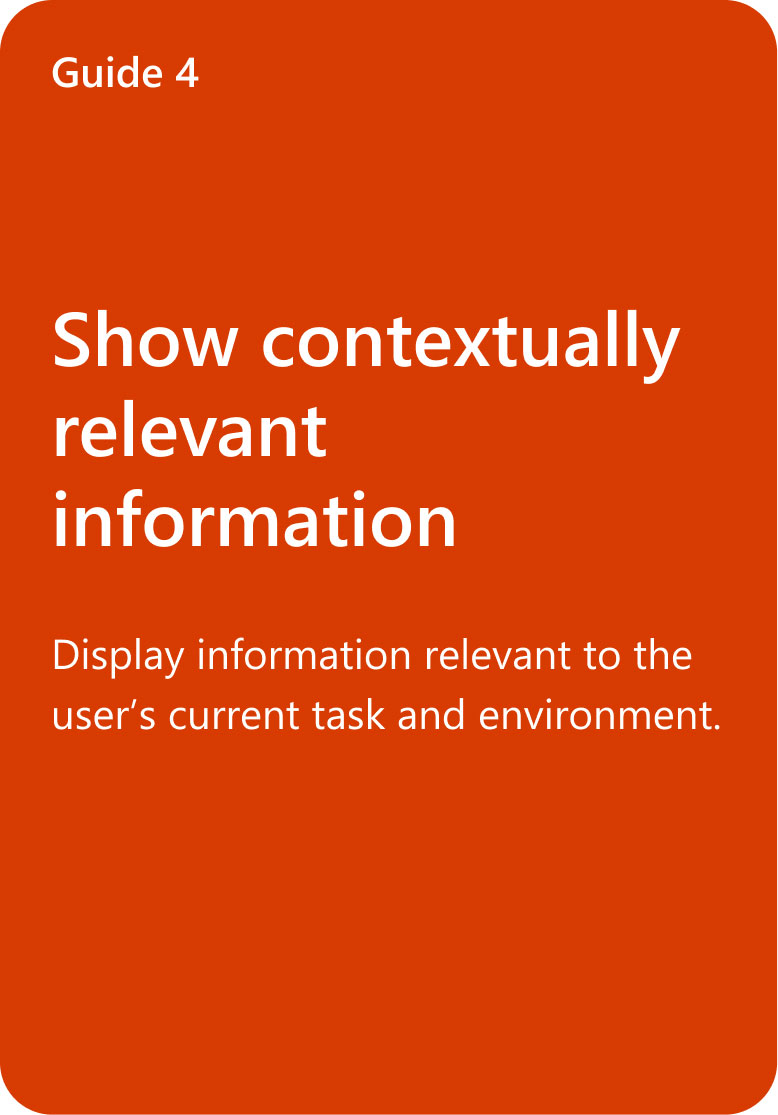
Related HAX guideline
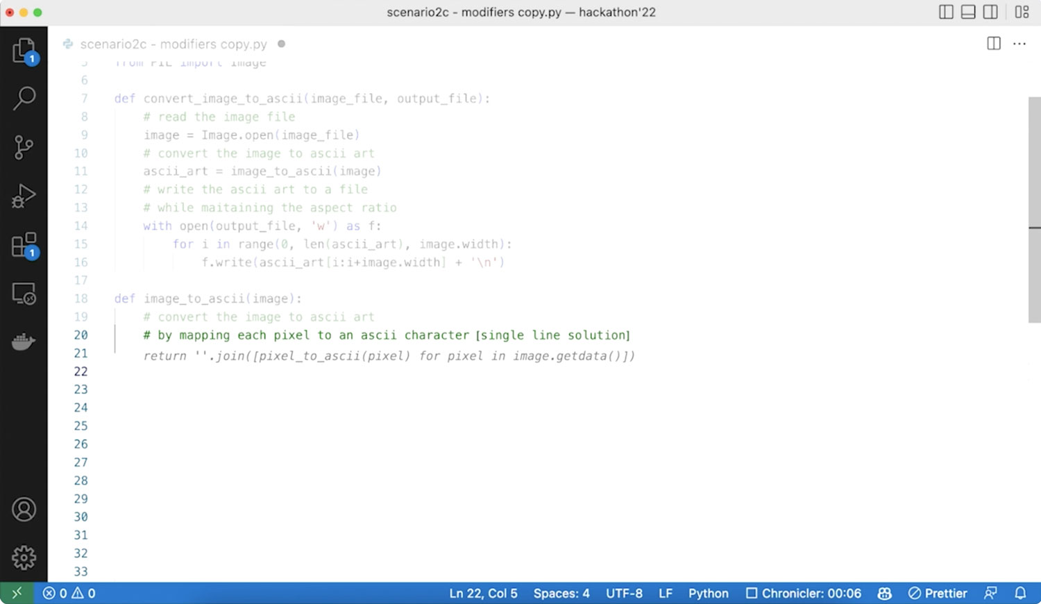
Auto-fill suggestion for users to easily clarify one’s intent
03. Uncertainty highlight
We found out that developers spend a significant amount of time verifying Copilot’s suggestions. We developed Copilot to talk directly to users when it’s uncertain about a suggestion by highlighting the relevant parts.
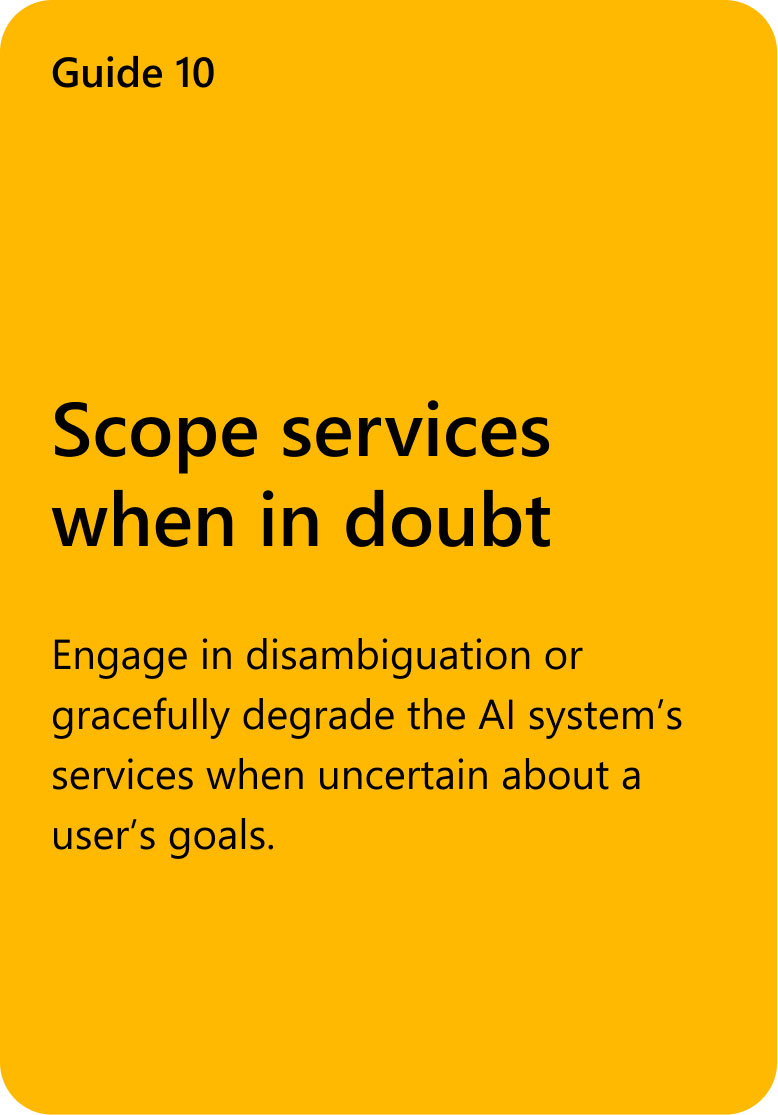
Related HAX guideline
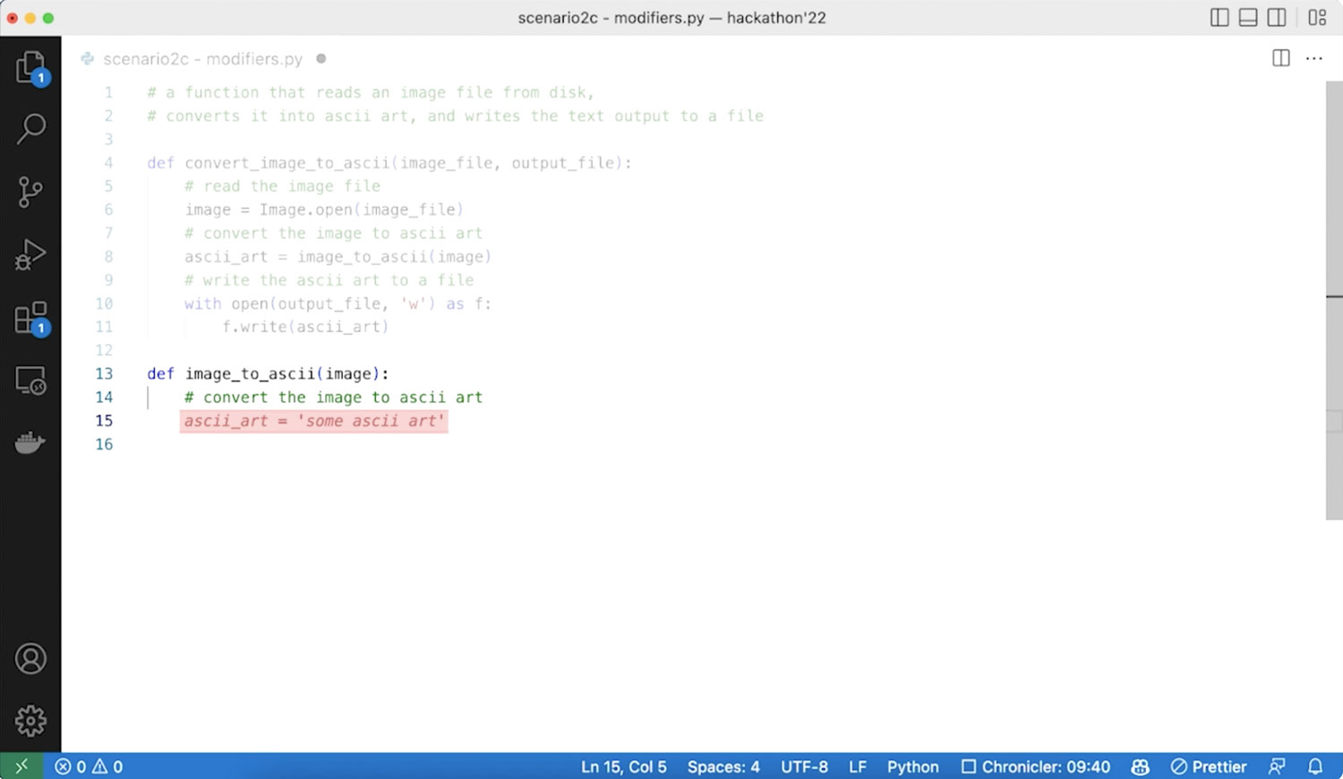
Highlighting areas with uncertain suggestions to encourage users to double-check.
Focus mode
We helped the product team shape the next version of the Image Creator by focusing on three key areas: improving the prompt building experience, providing a solution for copyright issues related to AI-generated images, and addressing users’ needs for connecting collections with their creations.
HAX guideline

A pedestrian playing AR simulation demo on display
Design solution

Improved feedback modal
(Solutions meeting time contained engineering requirement)
Human-AI experiences Toolkit (HAX)
Partnership from December 2022 to March 2023
- Human-AI experiences Toolkit, so called HAX, is hands-on tools for AI developers to create effective and responsible human-AI experiences
- Our objective was to enhance the website’s usability. We began by redesigning the site map, redefining HAX, and holding a priority-setting workshop. Our focus was on the Design Library since it is often users’ first interaction with HAX.
- Using previously conducted research data, I collaborated with other researchers to lead a design change for the Design Library.
biNG ai SEARCH
Challenge & Goal
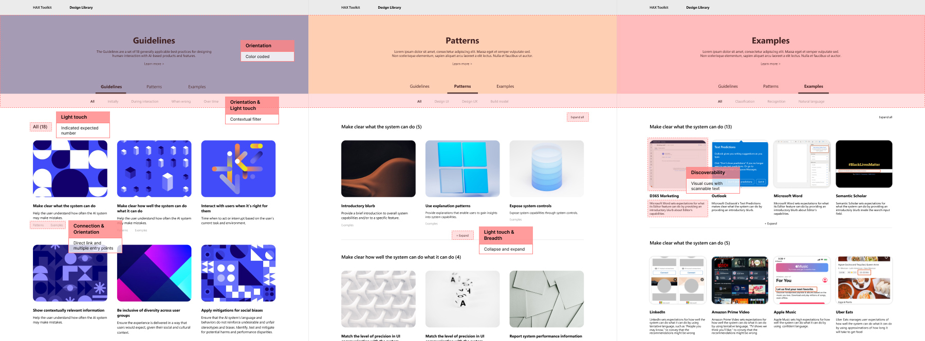
Since the HAX design library contains three levels of abundant information – guidelines, patterns, and examples – research showed that users were having problems comprehending and interacting with the tool, especially in Design Library.
To address these issues, our team conducted a workshop to identify key tenets, where we analyzed and grouped user research data. The following are the five principles:
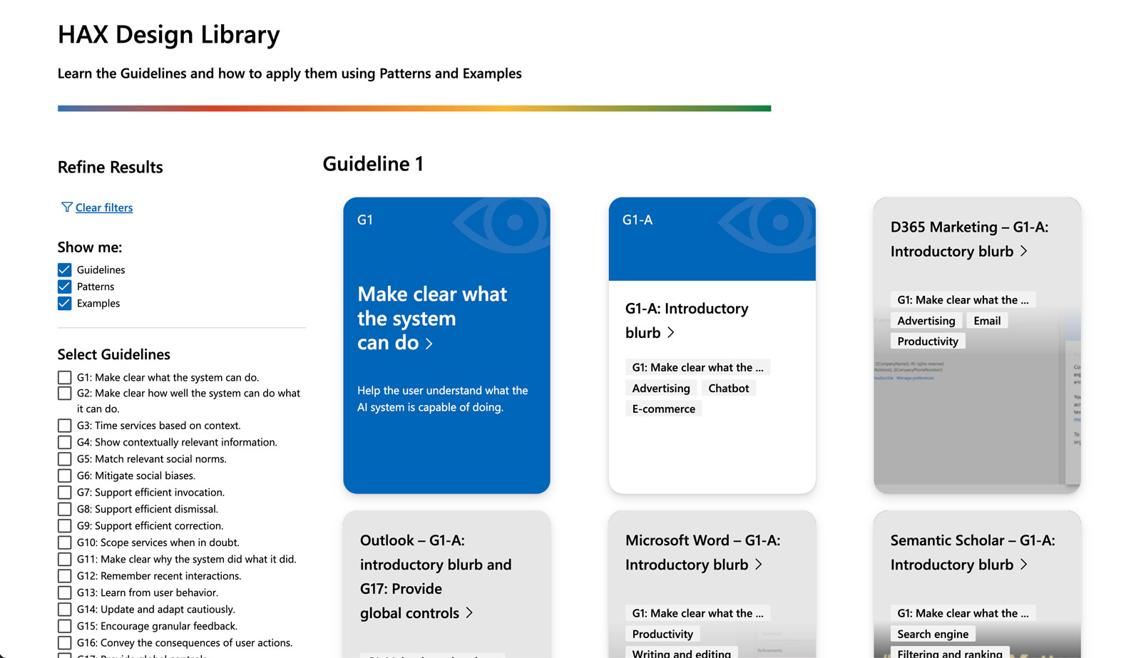
Existing design of Design Library
01. Discoverability
With the relevant guidelines in mind, users should be able to find the applicable patterns and examples to help answer their questions.
02. Orientation
Users should be able to determine their location and find directions to their desired destination.
03. Connection
Users should be able to understand the relationships between different materials.
04. Breadth
Users should have the ability to surface, review, and consume a wide selection of content.
05. Light touch
Users should not be weighed down or overburdened with excessive content.
Signal functionality
Help users understand how the tech works
10 AR simulations
Designed immersive content simulating frequently happening accidents
Drivers & pedestrians
Created separate content with ‘driver point of view’ and ‘pedestrian point of view’ to effectively communicate how accidents occur
Reduce cognitive load
Help users get the image they were looking to create with better experience of writing prompt and with clear notice on blocked prompts
Invision and connect
Improve the product by connecting users’ needs to convert collections into creations.
biNG ai SEARCH
Outcome
- I created low and high fidelity wireframes and interactions for the website with the aim of improving the five tenets. Unfortunately, the project was discontinued due to team reorganization.
- Our team also took into consideration the following design points that were not noted in the initial user research when approaching different wireframe designs.
- Do users come to the Design Library with specific questions they need to solve, or do they come to start designing an AI product?
- Will users come for guidelines, patterns, or examples?
Initial proposal
In the initial proposal, we explored different wireframes with varying levels of 1) interactivity and 2) richness of content.
01. Drawer
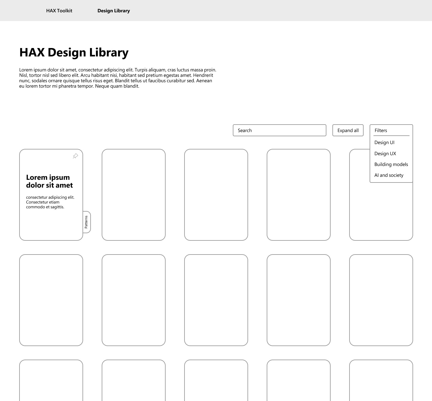
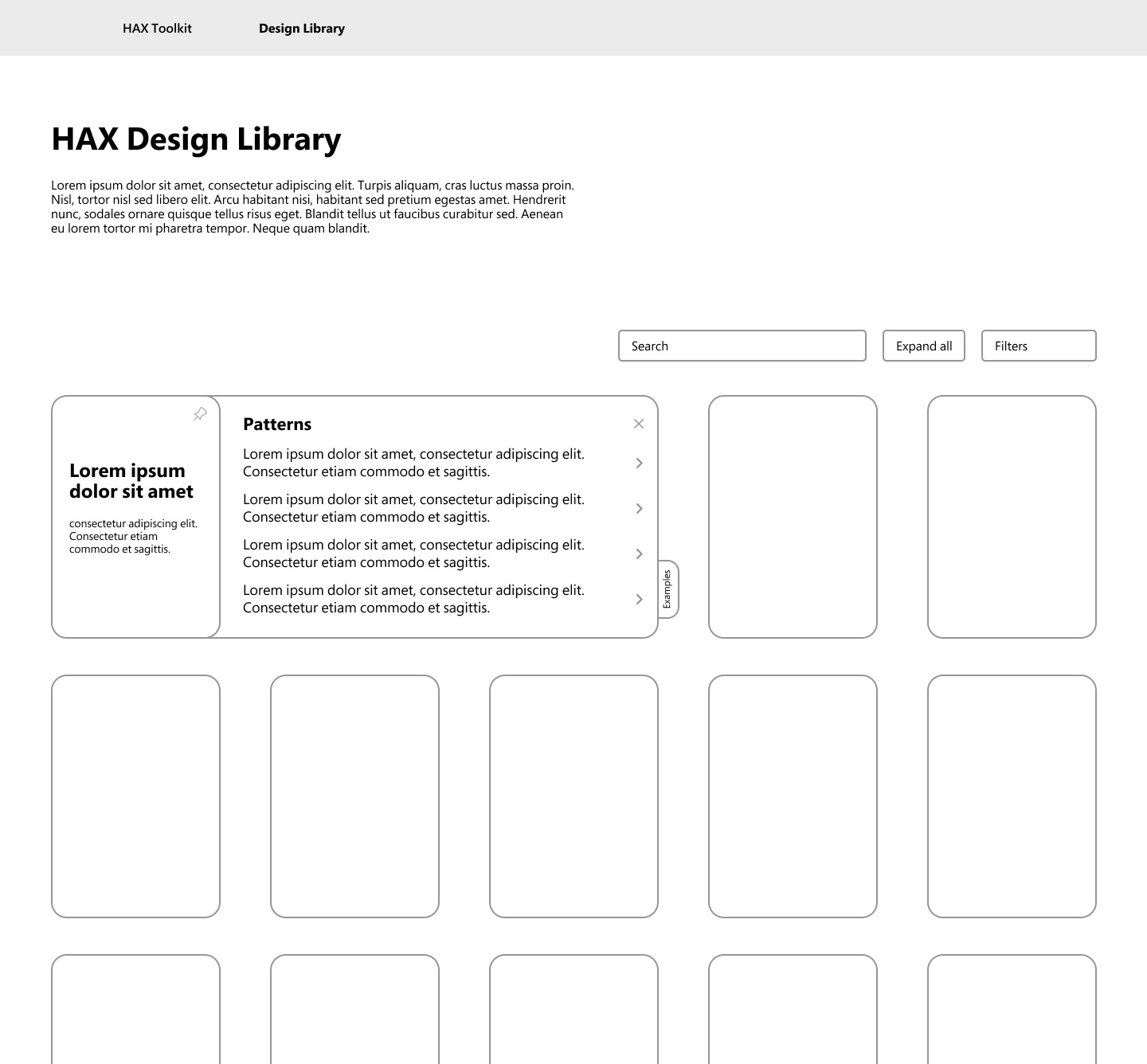
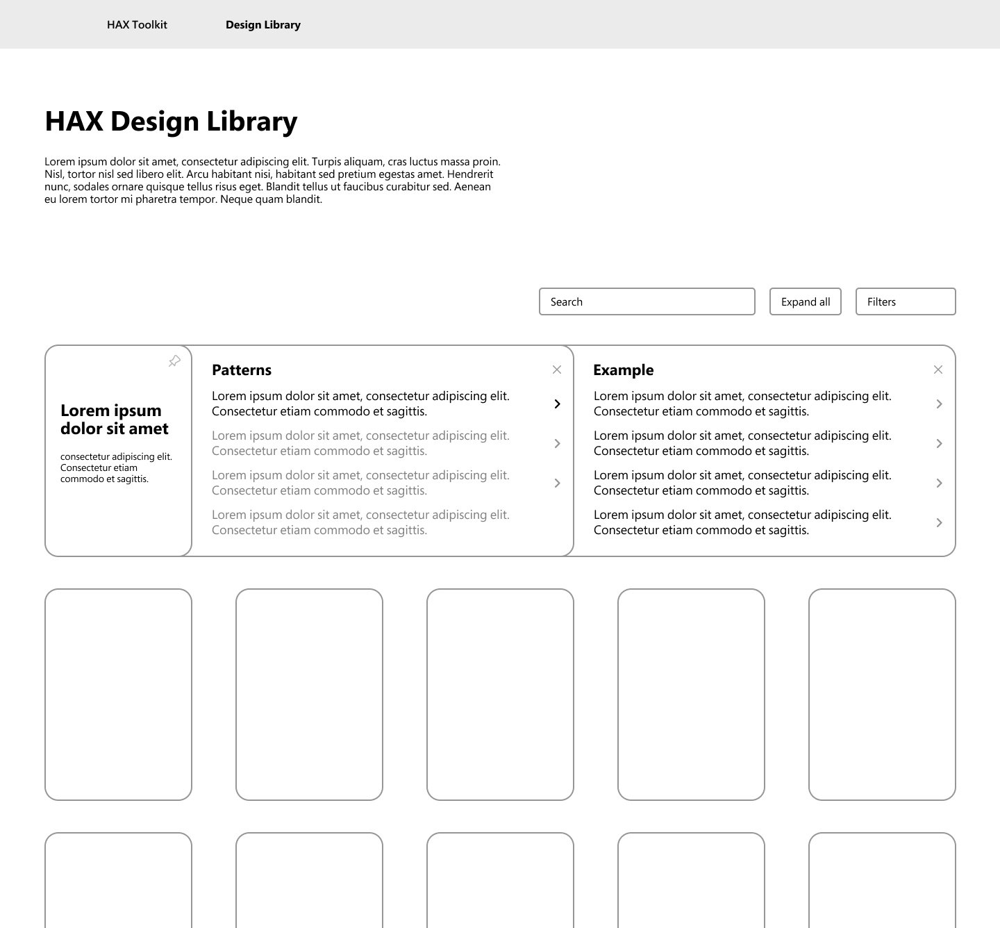
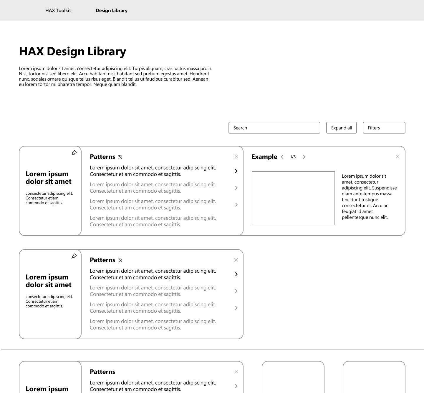
The design features a collapsible interface to meet users’ needs. Users can either view all options at once or only the option that applies to their needs. The interface has a clear hierarchy between the library, patterns, and examples through the drawer style.
02. Mad-lib search filter
The design features a filter header that allows users to input their search criteria, including the type of guide and stage of the project, for those with a specific goal in mind. It also provides users with the ability to explore using a category bar that clearly separates different categories.
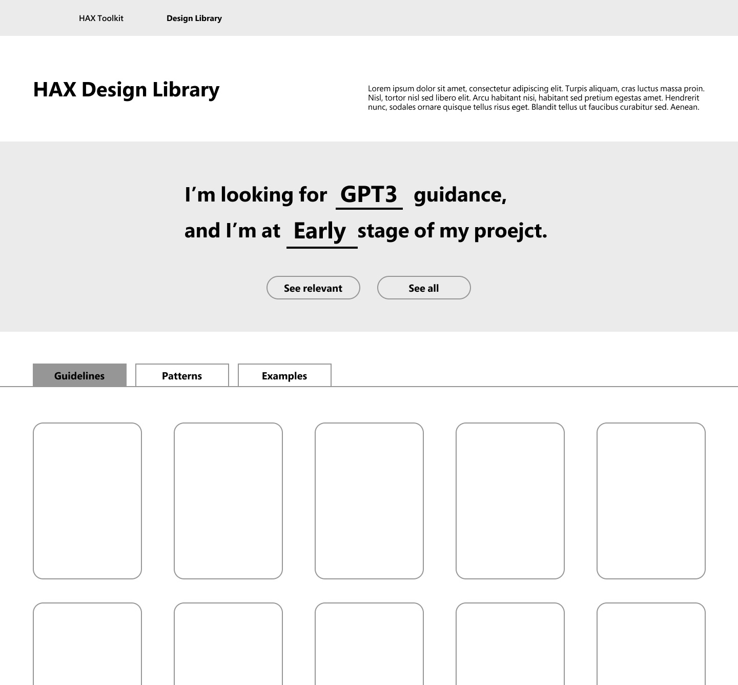
First encounter with the Design Library, which includes fields for narrowing down searches by allowing users to type in or choose from options
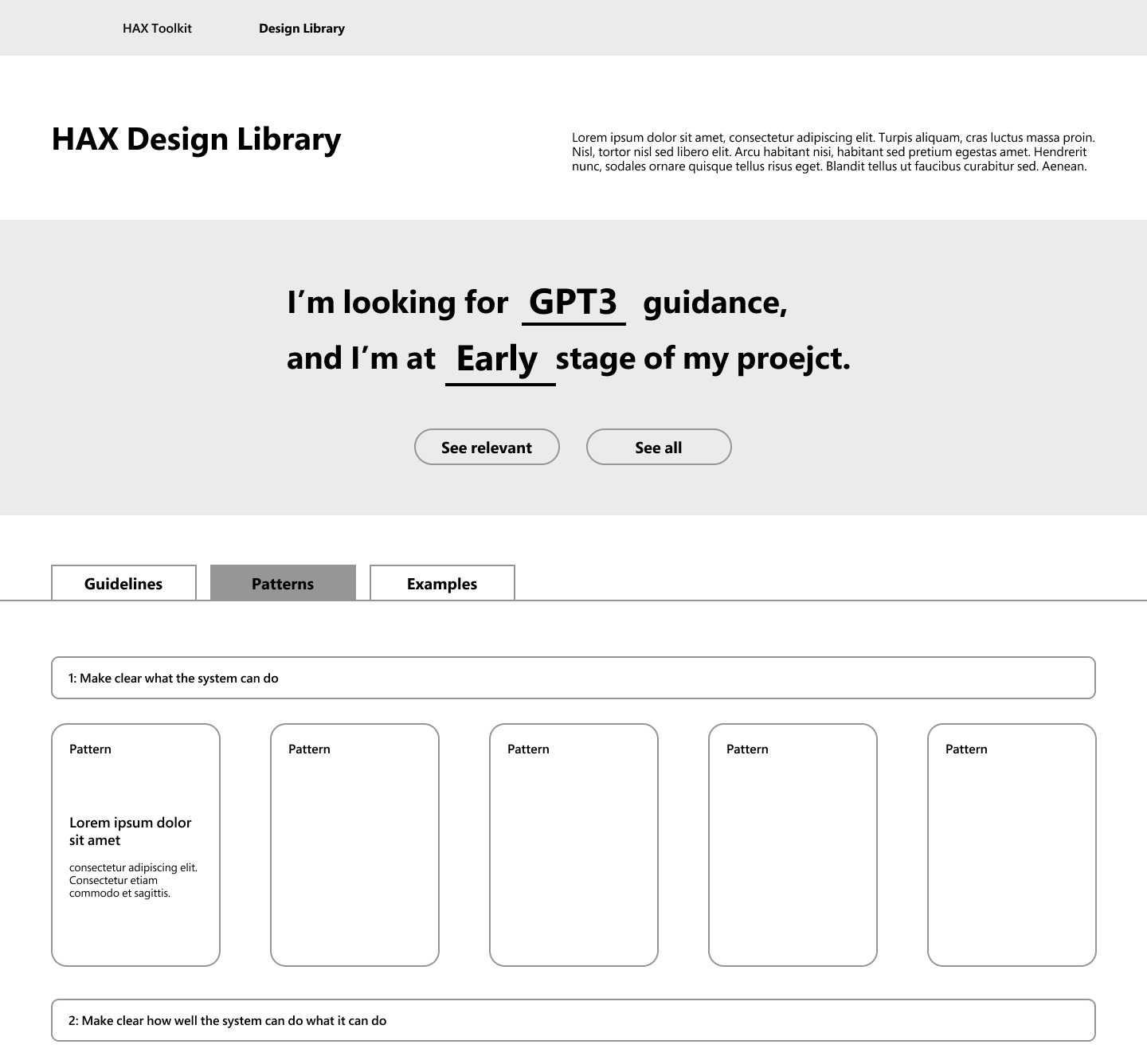
Pattern library sorted by guideline
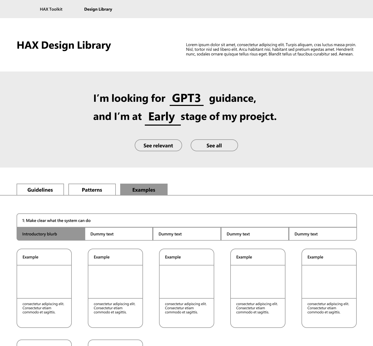
Example library sorted by gudelines and patterns
03. Flip card
The design is most interactive, allowing users to flip the card on mouse click. Its rich content style enables users to view all categories within a card with a simple action.
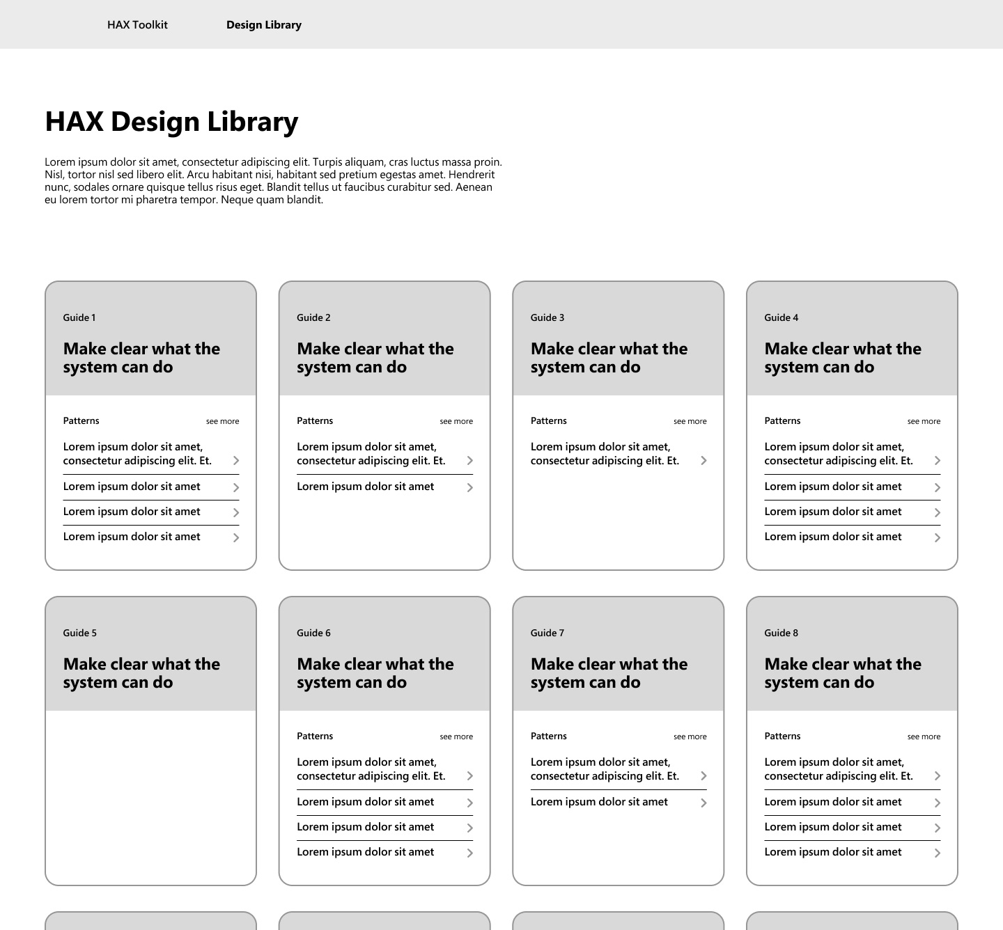
First encounter with the Design Library, where it showcases both guidelines and patterns that fall under each guideline. It makes it easier for users to understand all the guidelines in fewer pages, due to library’s rich content
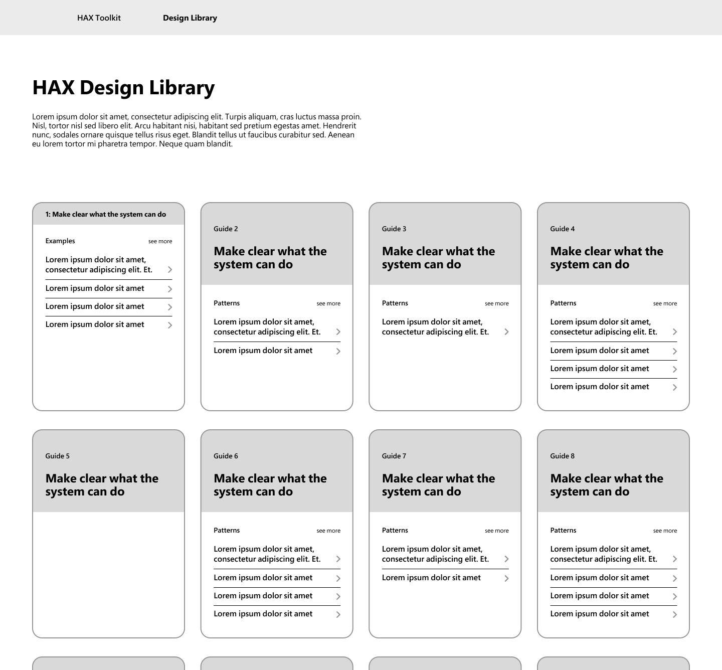
Displaying examples when a card is clicked
Modified proposal
After receiving feedback on the initial proposal and considering the fixed budget, I have decided to prioritize simplicity with minimal interaction.
The second prototype addresses the five principles with the following design solutions. To provide a better understanding of the user’s experience with the design library, I created a high-fidelity wireframe and demonstrated the information architecture through the prototype.
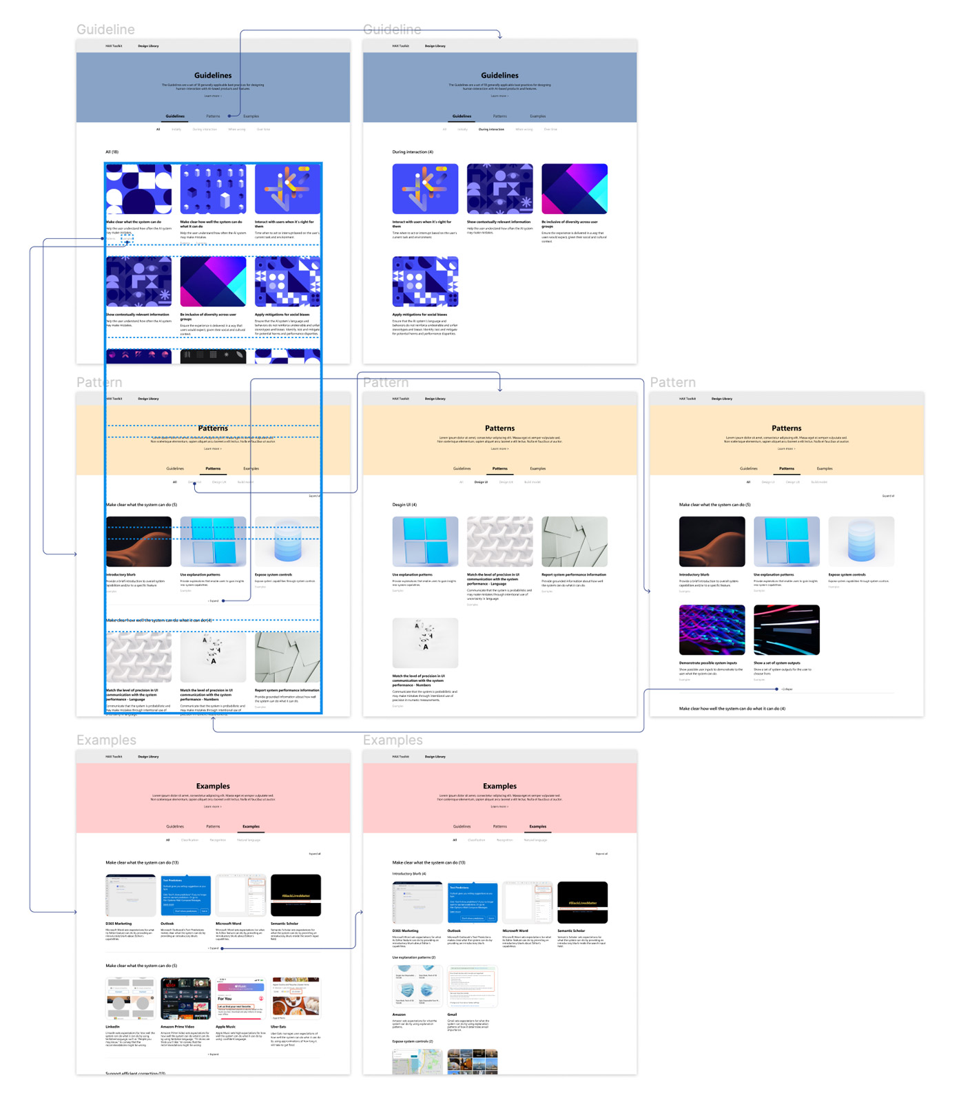
Information architecture of the modified proposal


